Website Specification
This document is a specification for my intended website
Subject
The subject for the intended website will be video games and technology.
Purpose
The main purpose for the website will be to accompany my YouTube channel dedicated to video gaming. The website will have a blog where I will post about new videos on the channel and other gaming content. Links to my social networks including Facebook and twitter will be on the website so people can keep up to date.
Target Audience
The intended target audience for the website are young people and adults who are interested in video games.
Content
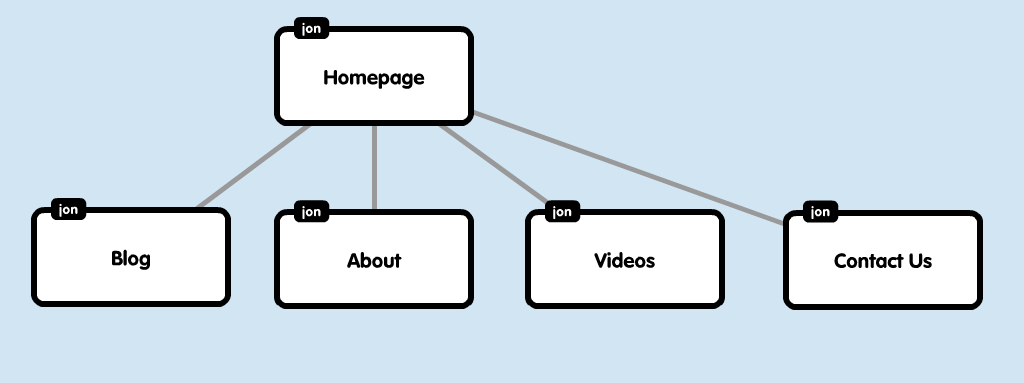
The website will contain 6 pages the first of which is the homepage where it will display featured content. The next page will be the blog where I will post about the new videos on the channel and other gaming content. The next page will be the About section with a FAQ where I will put information about myself and my video game set up. The next page will be the Videos page that will have links to the videos on the youtube channel. The final page will be the Contact page with ways to contact me. All the pages will follow a traditional page naming convention the home page will be index.html and the other pages will be the page title.html for example the about section will be about.html and so on.
Legal and Ethical
The content for the website including the logo and other images will not infringe copyright and be compliant with the Digital Millennium Copyright Act (DMCA).
Website Research
Here are some screenshots of a few different websites and I have identified aspect of the websites that I like and could incorporate into the design of my site. As well as things I don't like and my reasons why.
Yogscast
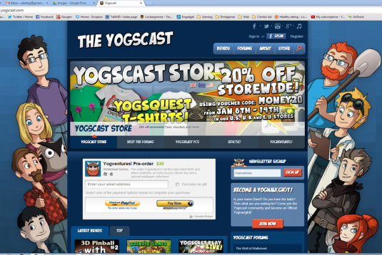
yogscast.com
I chose this website because i am a subscriber to their YouTube channel that produces gaming videos and I visit the website occasionally.
Pros
Pros
- Fixed width design as it scales well with different screen sizes. also keeps all of the content in the middle of the screen.
- Background image
- Featured content box beneath navigation that I would like to incorporate into my design
- Good use of colour
- Decorative fonts for headings makes some links is not that readable.
National Geographic
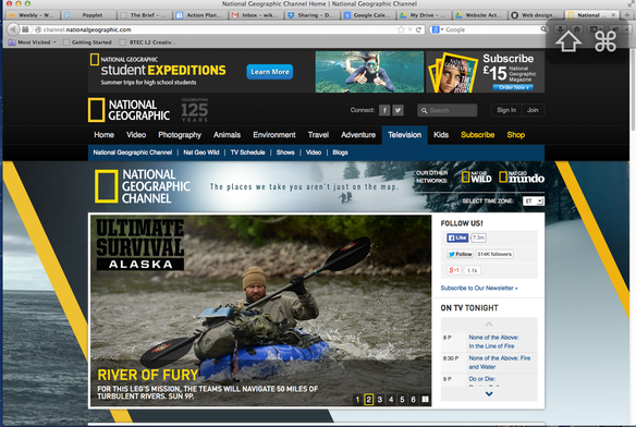
National Geographic homepage
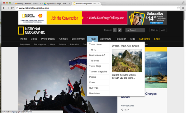
National Geographic drop down navigation
Although this website is not related to gaming, I chose it because I liked the use of the feature swapper and that it is something I wanted to include on my own site.
Pros
Pros
- The overall design of the website is quite formal so it is more in keeping with the type of content on offer, they haven't used any decorative fonts to make the text more readable.
- Good contrasting colours used in the design
- Drop down navigation use of images as well as text
- Very little advertising used on the page
- High quality images used
Day9TV
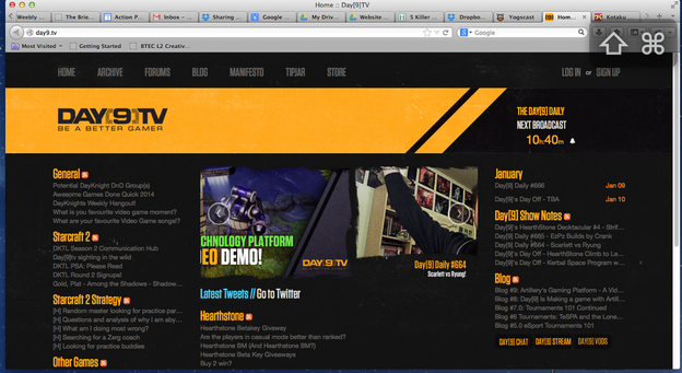
day9.tv website
Again I chose this website as I am a subscriber of the YouTube channel that does gaming videos.
Pros
Cons
Pros
- I like the use of colour on this website as it mainly consist of 3 or 4 colours and they are consistently used throughout the website. I would do a similar in my own website.
- The fonts used is very readable and the colours used make it contrast well against the dark background.
Cons
- The website has a full width design that may not scale well for smaller screens and on mobile.
Game Paused
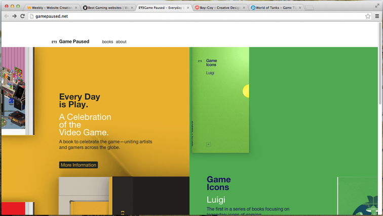
gamepaused.net website
Finally i chose this website as it is gaming related and I liked the simplistic design.
Pros
Cons
Pros
- Very simple design but very attractive in the colours and fonts used
- as the website is advertising a book it has matched the website design to that of the book
Cons
- Not a lot of information on the website at first look
Conclusion
After researching several different websites a common theme is to have the logo in the top left as in western culture we read left to right, that also links back to the homepage as this is what users come the expect. I have identified some aspects of the websites I would like to incorporate into my own design, including a image swapper and sticking to three the four colours to keep the design consistent. Most websites use a horizontal navigation at the top of the page either alongside or below the logo, vertical navigation is used for sub menus.
Siteplan
This is the siteplan for my website setting out the structure of the pages and the links between them.
Design
Website Design Sketches
Here are some sketches of my website detailing the layout of elements on the page and some design choices.
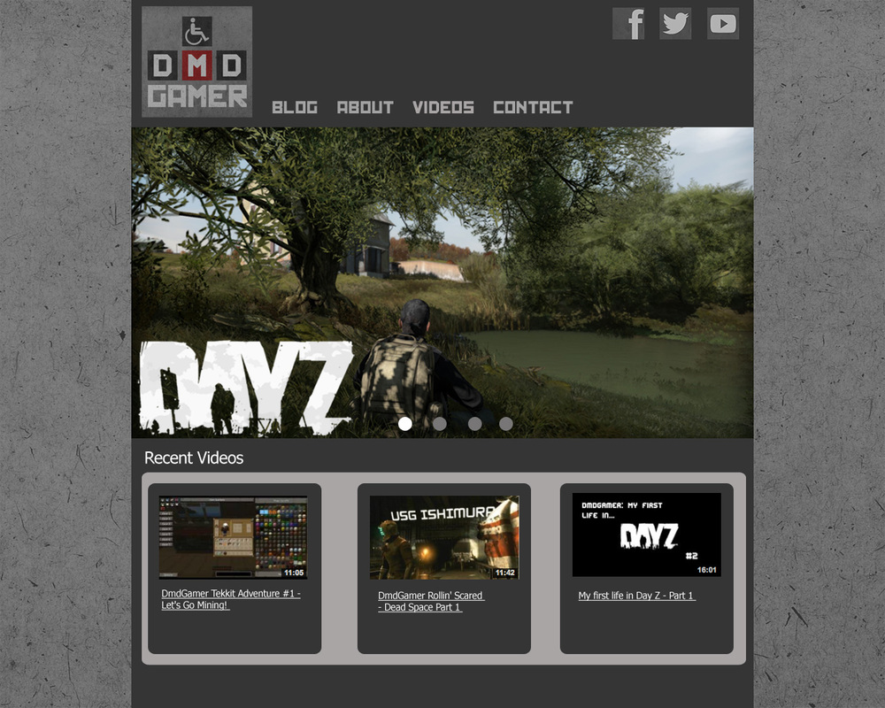
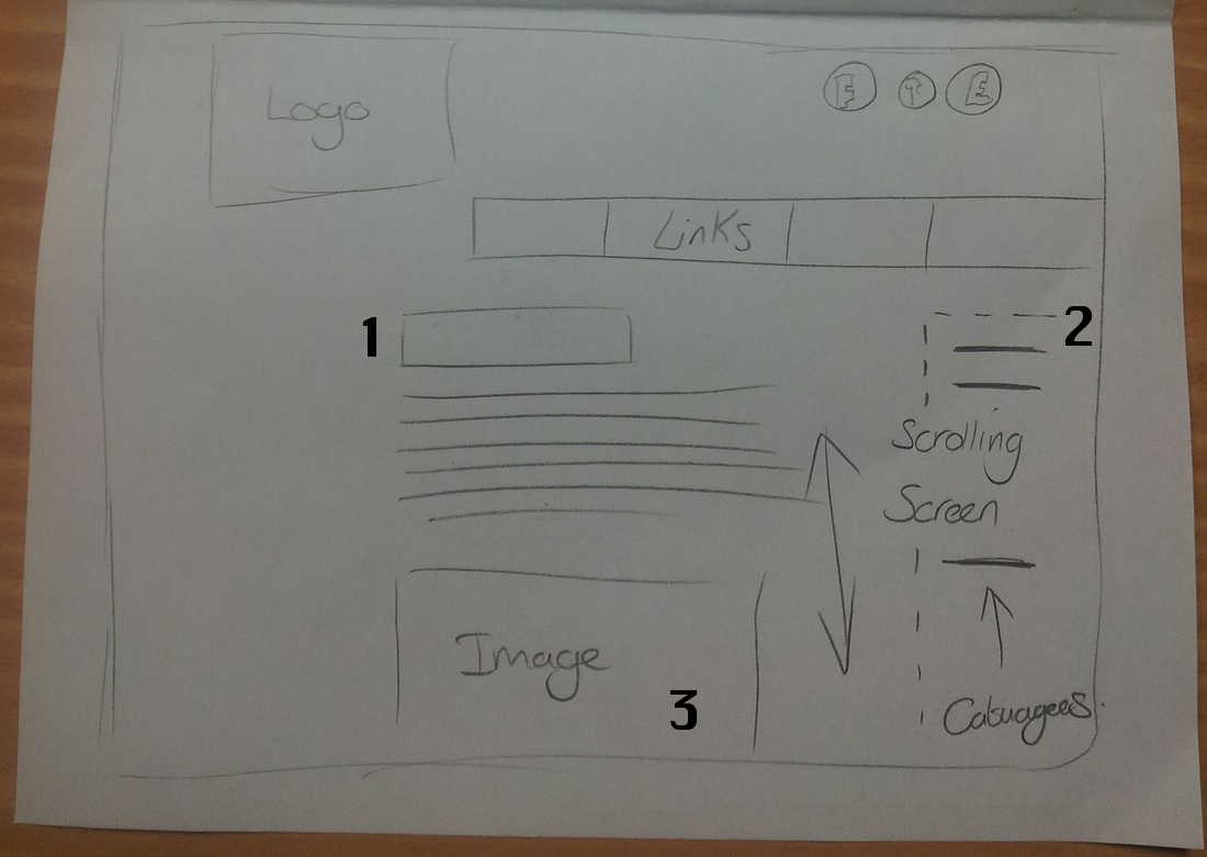
Homepage
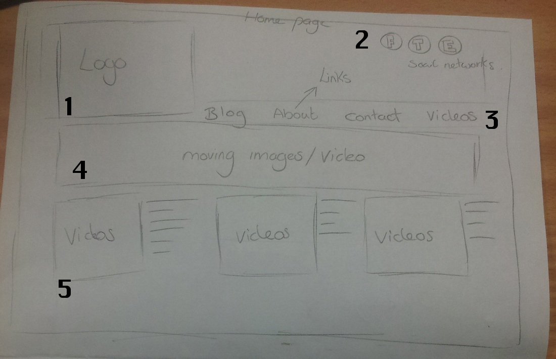
Above is a sketch of the homepage.
- I will have my logo in the top left of the page and the logo will link back to the homepage to make it easier to navigate.
- Links to social networks will be in the top right. when the mouse is over the icons they will change state.
- The top navigation will be horizontal underneath the logo banner. I will have a drop down menu for sub pages the links will change colour when moused over and will have a background around them on the current page.
- Under the header I will have a animated image swapper however this will require using javascript in order to achieve the effect. the swapper will have 4 different images to transition between with links at the bottom so when the user hovers over them the image would change to the corresponding image.
- At the bottom of the page would be links to youtube videos. Each will have a thumbnail image that would link to the video and text on the right hand side with a description. When the video is moused over it will have a background around it.
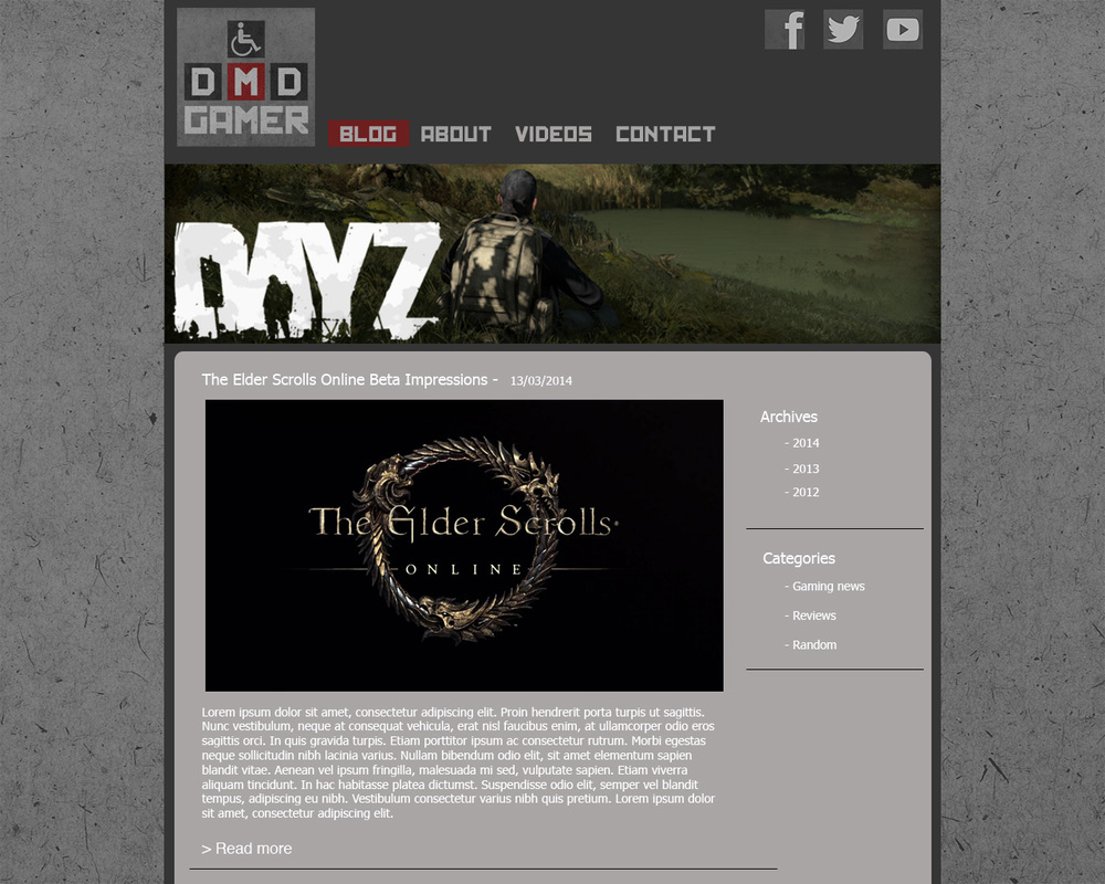
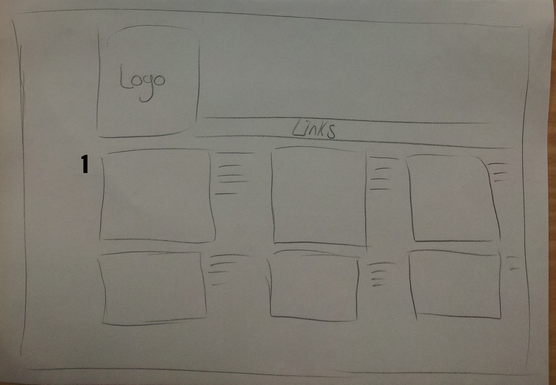
Blog Page
Above is a sketch of the blog page
- The title of the blog post will be on the top of each new post.
- On the side of the blog will be links to archive where people can view previous posts and categories to sort posts on.
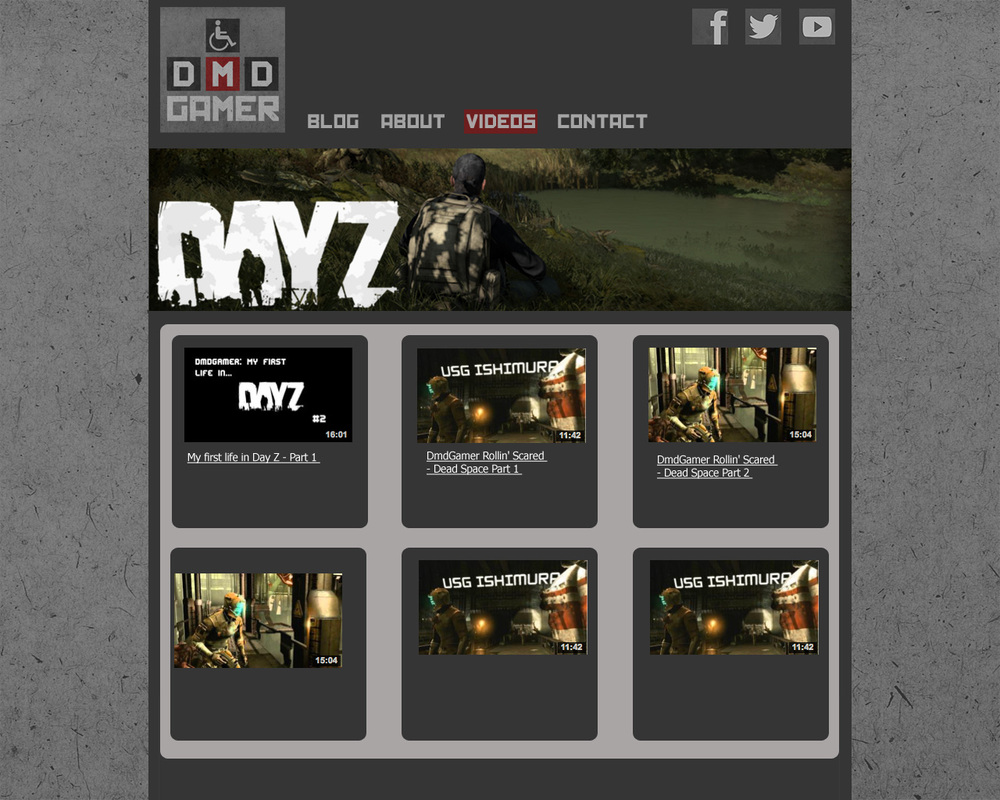
Videos Page
Above is a sketch of the video page.
- Each video will have a thumbnail image that will link to the video, alongside will be a short description of the video. When the user hovers over one of the videos it will have a transparent background to highlight it.
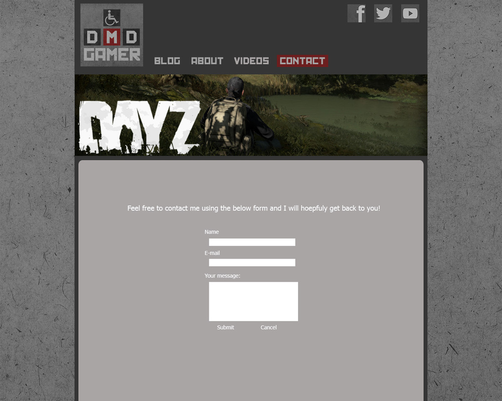
Contact Page
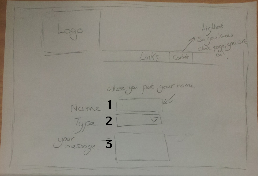
Above is a sketch of the contact page
- A text box for the contact form where the user can put their name.
- A box to select the type of communication with a number of different options for the user to choose from.
- Finally is a text box where the user can type their message, the size of the box can be scaled by the user. Underneath will be a button to submit the message.
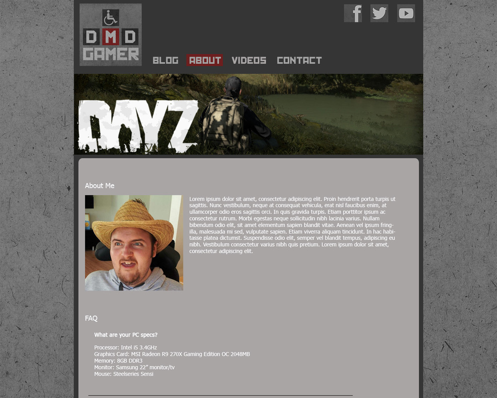
About Page
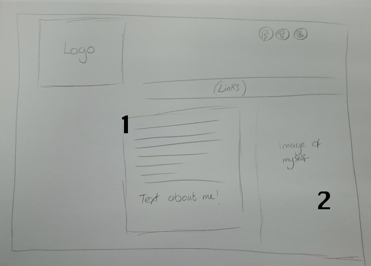
Above is a design sketch of the about page
- Some information about me and a FAQ section
- A picture of myself to accompany the information
Website Design Mock Ups
Here are some more detailed designs using Adobe Photoshop